Subscribe to:
Post Comments (Atom)
About Me
My Book!
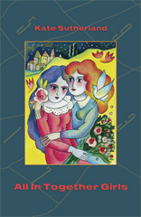
My second collection of short stories, All In Together Girls, is now available in Canada, the U.S., the UK, and most other places where English language books are sold. You can buy it at your local bookstore, or order it from online retailers such as McNally Robinson, Amazon, Chapters/Indigo, Powell's, or The Book Depository. You can also borrow it from a number of public and university libraries in Canada and the U.S. Check with your local library to see if they have it, and please encourage them to buy it if they don't!

5 comments:
Thank you, Kate. Anything is better than white on black--I could barely read for feeling like I was under a drug-induced haze. And not in a good way.
This is much better. I'm another who has difficulty reading white on black.
Me too. Dark text on a light background is so much easier on the eyes.
Better than before. I'll just add my two and a half cents from a graphic design educated background.
It does sort of boggle my mind that a lot of people use the white text on a black (or other coloured background). That's actually one of the first rules we learned in typography... try to avoid inversed type at all costs, and if you do use it, use it sparingly. Readability and legibility are seriously affected.
So the black on purple is better... but (and this is a combination of my opinion and what I have learned in school), really, the best layout is really just black text on white background. That's the easiest the read; most appealing for the eye. The most important element in a blog in the end is the content, and you've got that big time, my dear.
Yes, my vote--and I don't like black on white online except when it is toned down a bit, muted with a tinge of color. The usual web white is too much like sunny-day snow.
Post a Comment